Citi – Citi World Privileges
Turning a static rewards directory into a location-first discovery experience across 14 APAC markets
UX Research · Product Design · Design System
1M+
monthly active users across 14 APAC markets
73%
faster time-to-task
post-launch
14
markets served
one design system
1M+
monthly active users across 14 APAC markets
73%
faster time-to-task
post-launch
14
markets served
one design system
My role: Design lead
Platform: Web + mobile app
Scale: 2,000+ offers across 14 APAC markets
Duration: 6 months
Team: 2 Designers, 1 UX strategists/researchers, Product & Tech Manager (Citi APAC team)
TL;DR
:: The Project
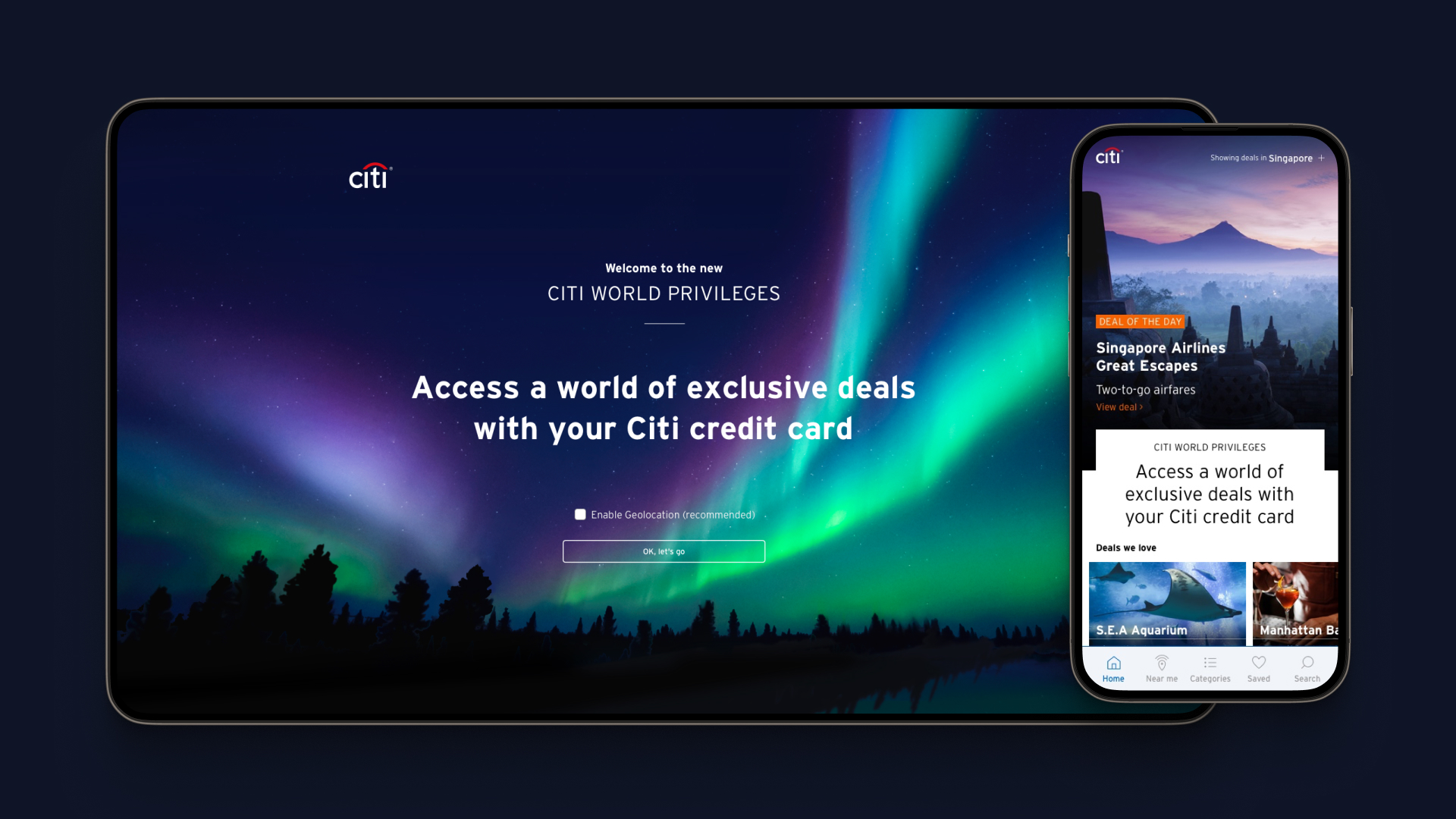
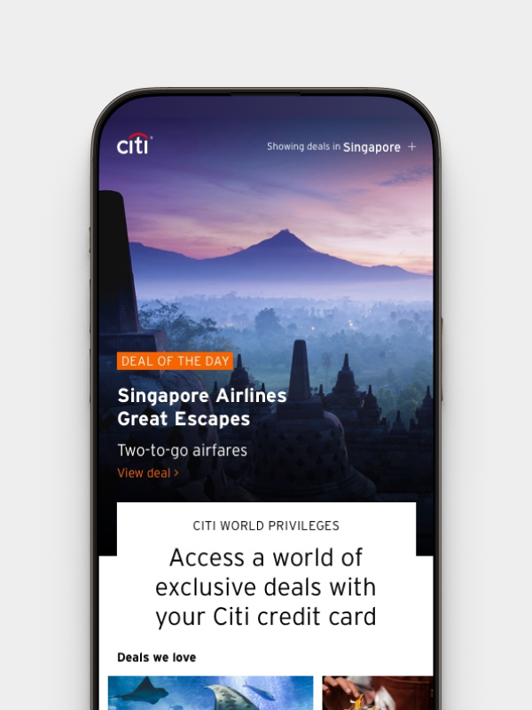
Citi World Privileges is one of the largest cardholder rewards platforms in APAC, with 2,000+ dining, shopping, and travel offers across 14 markets. Despite that scale, engagement was low. The existing product was a desktop-first static directory with no personalisation and no mobile experience. We were brought in to redesign it from the ground up.
:: My role
Day-to-day design lead within an agency engagement at Shift Partners. I directed 2 designers, co-led research with our UX researcher, and owned the design system end to end. An Experience Director handled client and business management. I ran design across the full arc from kick-off to handoff, making the core architectural decisions and presenting findings directly to the Citi APAC team.
:: What I did
Led qualitative interviews and competitive benchmarking before a single screen was designed, then validated findings with 30+ Citi cardholders across diverse APAC markets. Research reframed the brief from "improve navigation" to "build a location-first discovery experience." I built two competing prototypes on opposing hypotheses, tested both with real users, identified the winning direction, then ran a dedicated iteration round addressing six specific failure modes surfaced in testing. Built a net-new modular design system against Citi's Digital Design Language, documented it in Figma, and ran engineer handoff sessions directly.
:: Result
1M+ monthly active users across 14 APAC markets. 73% reduction in time-to-task. Higher session depth and repeat usage post-launch. The modular design system enabled consistent launches across all 14 markets without a separate design track per market.
:: Context
A massive catalogue. Almost no engagement.
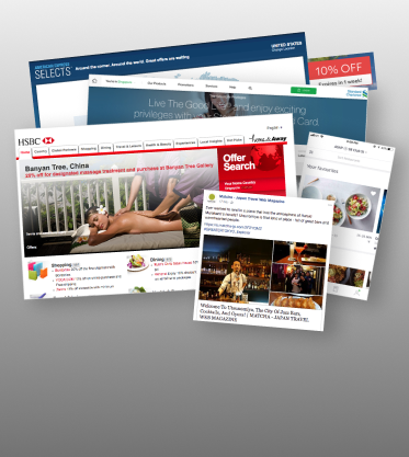
Citi World Privileges had 2,000+ dining, shopping, and travel offers across 14 APAC markets. Despite that scale, engagement was low. The existing product was desktop-first, non-mobile-friendly, and structured as a static directory with no sense of context or relevance.
We were brought in to redesign it from the ground up. The brief was broad — improve engagement. My first move was to understand why engagement was low before anyone opened Figma.

Hover around
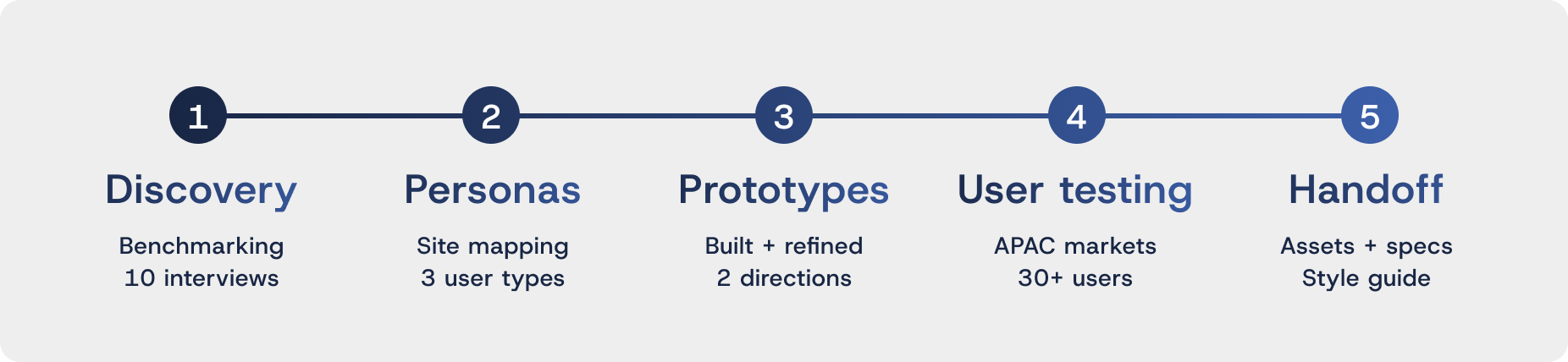
:: Process
A structured engagement, not a linear one
The project ran across five defined stages with fortnightly stakeholder check-ins built in from day one. Rather than disappearing for weeks and returning with finished screens, we presented findings progressively — keeping Citi involved in every significant decision.
:: Research
Reframing what the problem actually was
The assumption at the start — shared across the client team — was that users weren't engaging because they couldn't find the right deals. Before designing anything, I made the case for research first. A better-looking version of the same broken experience doesn't change behaviour.
Working with our UX researcher, we structured discovery across three parallel tracks.

In-person sessions,
Website stimulus,
Age 20–39 · APAC
Google Maps · Klook
Discovery patterns
Relevance at scale
Diverse APAC markets
Validated direction
Add-on scope
Hover around
User insights form interviews
Idon’t want to go in for the discount, and walk out having wasted my precious holiday time.
I don’t care where the discount comes from, Google finds it for me.
You can only trust pictures from real people, not the hotel!
Points are my main motivator, I would very rarely seek out specific offers like restaurant deals.
I’m sorry, but this just doesn’twork.
I want to be able to easily search, butstill get a hint of the offers inside.
I search for flight and accommodation deals first, everything else sort of happens when we are there.
It’s only useful if I know deals in Shibuya, not in Tokyo.
I don’t know what I want to do, but I don’t want to miss out on the best the city has to offer.
It’s too much, too many pamphlets, pushing things you don’t need. Howcan Thai Express and MBS fine dining be on the same page?
The research was direct. Users told us the existing experience simply didn't work. They were starting their trip planning on Google, not in the app. And when they did open it, the volume of undifferentiated offers felt like noise — "It's too much, too many pamphlets, pushing things you don't need."
The sharpest insight came from a user who said: "It's only useful if I know deals in Shibuya, not in Tokyo." Another: "I don't know what I want to do, but I don't want to miss out on the best the city has to offer."
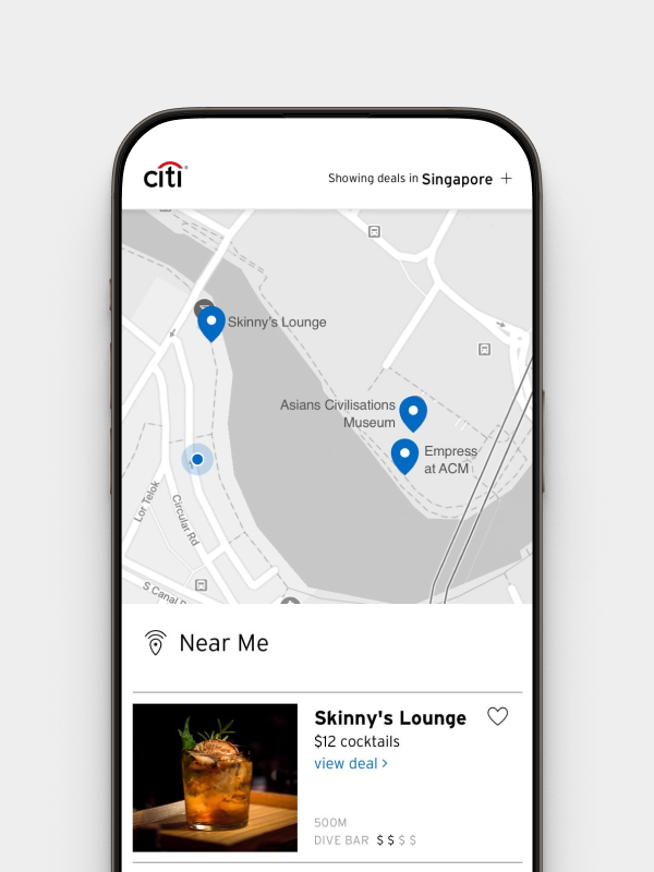
This is why better search wouldn't have solved it. Search only works when users have intent. The largest group had none — they needed the app to act first. That's what led us away from a search-led direction entirely, and toward a product that surfaced relevant, nearby deals without waiting to be asked.
The insight that reframed everything
Discoverability was not a navigation problem.
It was a location problem.
The user's mental model was consistent: the app should already know where I am and show me what's nearby. We presented these findings to the Citi APAC team. The brief shifted from "improve navigation" to "build a location-first experience."
:: Who we designed for
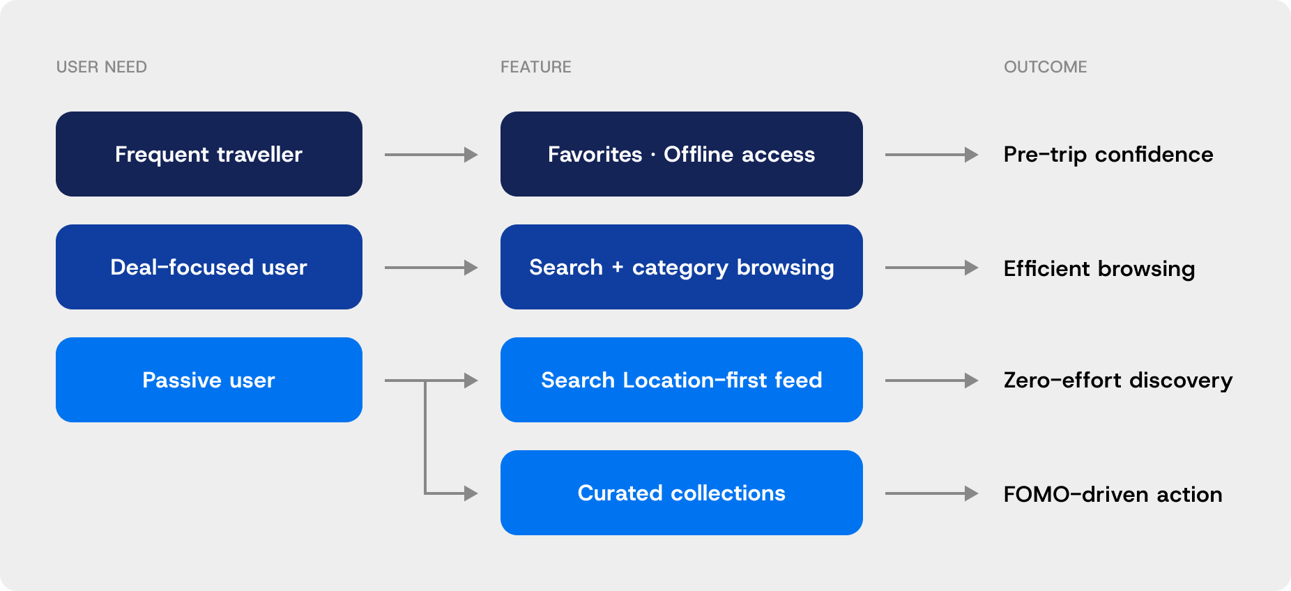
Three users. Fundamentally different needs.
Research revealed three distinct user types — designing for the average of all three would have served none of them well.


Need:
Offline reliability
Multi-market access
Design response:
Offline reliability
Multi-market access


Need:
Fast, filterable search
Full catalogue access
Design response:
Search
Categories nav


Largest · most underserved
Need:
Zero-effort discovery
FOMO-driven curation
Design response:
Location feed
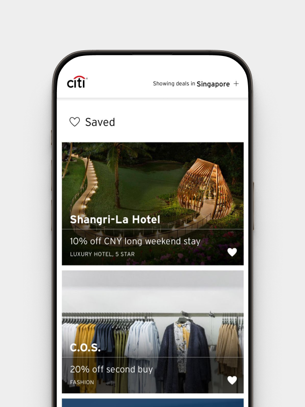
Collections
This segmentation drove every design decision that followed. The product had to serve all three simultaneously within one coherent experience.
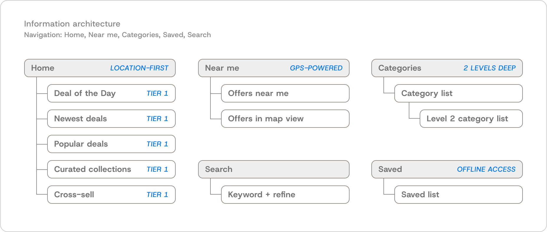
:: Defining the structure
IA decisions before any visual design
Before prototyping either direction, we had to answer a more fundamental question: what does this product actually need to contain, and how should it be organised? Three structural decisions came directly out of the persona work.
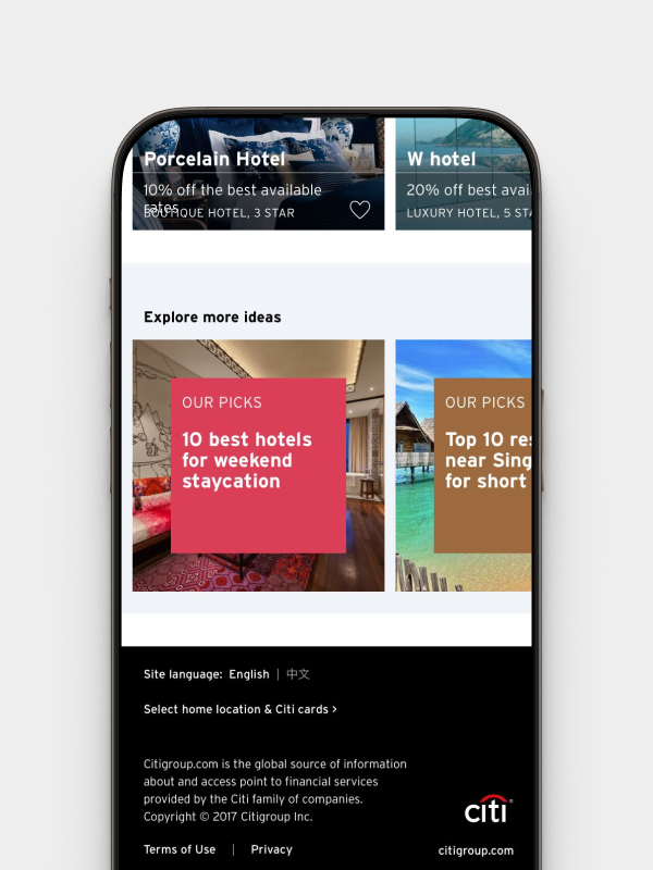
The navigation model had to give each user type a direct entry point. The content needed a hierarchy, not a flat list — 2,000+ offers without editorial logic is noise. And the default experience had to make a choice: a product that tries to serve everyone equally serves no one well.
:: Two directions, tested with 30+ users
Search-led vs deal-led. One clear winner.
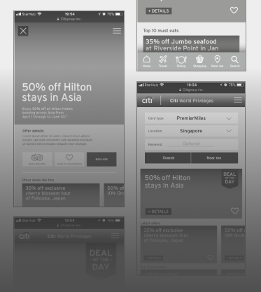
I built two prototypes on opposing hypotheses — Search-led (query-driven, utility-first) and Deal-led (proximity-first, discovery-oriented) — and tested both with 30+ Citi cardholders across diverse backgrounds and APAC markets.
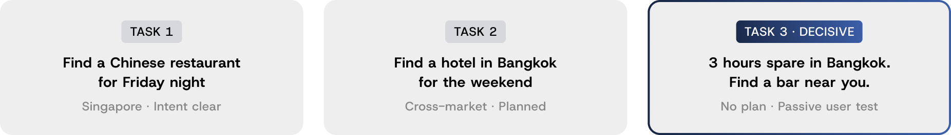
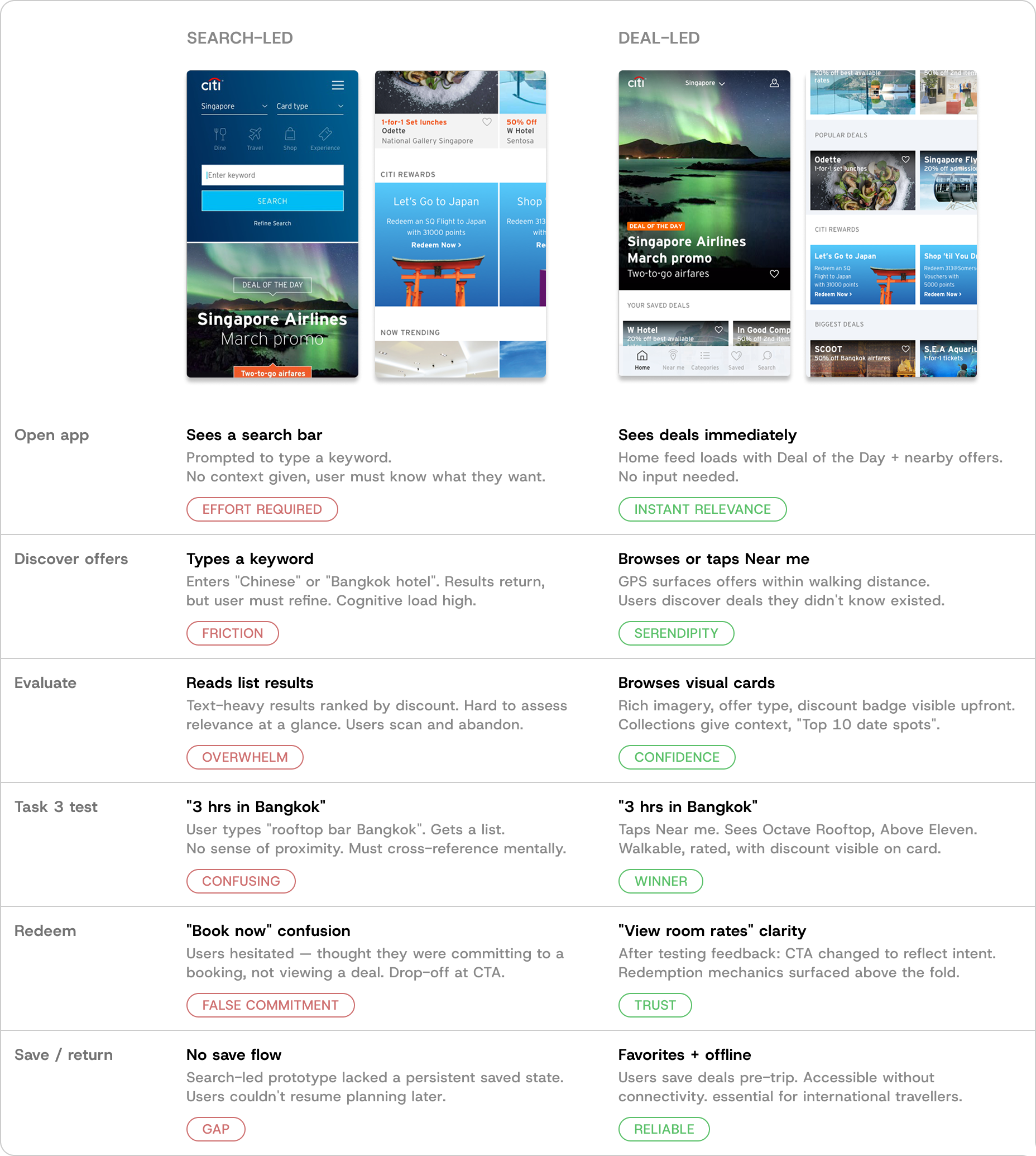
Deal-led won decisively. Users described it as easier to browse, cleaner, and more Citi-like. Several noted they'd use their Citi card more as a result — a business outcome, not just a UX one. We also tested two value propositions — "Access a world of exclusive deals with your Citi card" outperformed the alternative by generating pre-travel excitement and setting accurate expectations about redemption.
:: What we built
Four features. Three users. One product.
The deal-led direction had to serve all three personas simultaneously within one coherent experience.
:: Design system
One system. Fourteen markets.
The platform needed to serve 14 markets — different languages, content densities, cultural conventions — without a separate design track per market. I built the component library from scratch against Citi's Digital Design Language, adapting brand values for mobile legibility.
Every component — offer cards, filters, map pins, collection modules, deal hierarchy badges — was built for localisation flexibility. I directed the junior designer across the library, owned all Figma documentation, and ran engineer handoff sessions directly.


:: Result
From dormant directory to active discovery platform

Citi World Privileges reached 1M+ monthly active users across 14 APAC markets with a 73% reduction in time-to-task. Session depth and repeat usage both increased post-launch. The modular design system enabled consistent rollouts across all markets without per-market design work.
:: Reflection
Testing with 30+ users before committing gave us the confidence to make a bold call and defend it with evidence, not opinion.
Two things I'd do differently. I'd define a data strategy at kick-off — the geo layer was a strong foundation, but deeper personalisation needed a pipeline that was never scoped. And I'd make engineer handoff more proactive — the mobile rendering issues after web launch were predictable, and a proper pre-launch session would have caught them.
