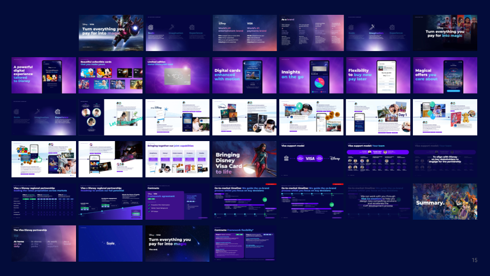
Visa APAC x The Walt Disney Company (Casestudy - Work in progress)
Designing the future of a co-brand experience - before it existed
User Journey Architecture · Product Strategy · Interaction Design · Prototyping
1M+
monthly active users across 14 APAC markets
73%
faster time-to-task
post-launch
14
markets served
one design system
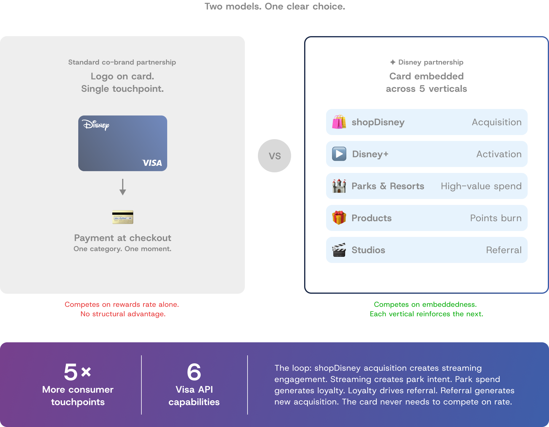
5x
More consumer touchpoints than a standard co-brand
6
Visa API capabilities integrated
5
New revenue loops designed
My role: Lead UI/UX Designer — Visa agency partner
Platform: Web + mobile app
Duration: 8-week co-creation sprint
TL;DR
:: The Project
Visa's APAC innovation team had a partnership hypothesis: a Disney co-brand card embedded across Disney's entire consumer ecosystem would structurally outperform a standard co-brand on acquisition, spend velocity, and churn. The commercial thesis was sound. What did not exist was a designed experience to prove the model to Disney's senior leadership.
:: My role
Lead UI/UX and Creative Technology Consultant. I set the design direction, made the core methodological decisions, ran co-creation sessions with the Visa team, and owned every output.
:: What I did
I diagnosed a fundamental framing problem in the brief, redirected the team toward a narrative-led product architecture, designed three characters mapped to distinct commercial objectives, and co-built five product flows grounded in Visa's real API capabilities. Every design decision was made against an explicit design question with a visible tradeoff.
:: Result
Disney's senior leadership responded strongly. The session moved from strategic interest to execution planning. The prototype was navigated live in the room across five product pillars, five Disney verticals, and six Visa API capabilities - not presented on slides.

:: The Opportunity
Most co-brand cards underperform.
This one did not have to.
Most co-brand cards fail commercially because the brand relationship is superficial - the card carries the logo but the product delivers nothing the brand actually promises. Visa's thesis was different: Disney's consumer ecosystem is wide enough and emotionally deep enough that a card embedded meaningfully across it would create compounding advantages no single-category co-brand could replicate.
Higher acquisition intent at Disney purchase moments. Higher spend velocity among Disney-engaged households. Lower churn tied to a brand relationship with emotional roots going back to childhood. The gap was a designed experience to make that thesis tangible and investable.
:: Diagnosing the Brief
The initial approach was logical.
It was also wrong.
Brief received
Map Visa's API capabilities to Disney's touchpoint.
Design flows for each
The brief pointed toward feature mapping: take Visa's API capabilities, identify Disney touchpoints, design a flow for each. It is a rigorous starting point for the wrong question. Feature mapping answers "what can this product do." It does not answer "why would a cardholder reach for this card instead of the one already in their wallet."
My diagnosis: the core problem was not interface design. It was motivation design. The product needed to give specific people a genuine reason to choose this card, use it in high-value categories, and bring others into the ecosystem. I proposed a two-week narrative architecture phase before any screens were designed. The Visa team were sceptical. I made the case that rigour in the wrong direction produces precise answers to the wrong question. We aligned on the approach.
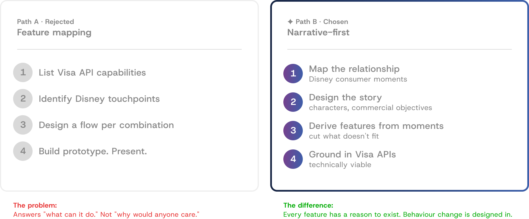
The conversation with Visa
The team were sceptical - a narrative phase felt less rigorous than capability mapping. I argued that rigour in the wrong direction produces precise answers to the wrong question.
We aligned on a two-week narrative architecture phase
before any screens were designed.
:: The Design Methodology
Narrative-first is not a storytelling
technique. It is a design constraint system.
Features designed first and connected to a story afterward produce features looking for emotional justification. When you design the story first and derive features from it, every feature has a built-in answer to "why does this exist" and "what behaviour is it designed to trigger." Features that cannot find a genuine place in the story get cut. This discipline keeps the product focused on interactions that drive engagement rather than those that impress in a capability list.
I started by mapping the Disney consumer relationship, not the Visa product. Three structural insights shaped everything that followed. First: Disney's highest-value consumer moments are relational, not individual - almost always experienced with or for someone else. Second: the gap between Disney engagement and Disney spending is highest in the cross-market family context. Third: BNPL and exclusives have the most commercial upside on aspirational transactions that sit just above what someone would normally authorise themselves to spend.
These insights produced three characters, each mapped to a distinct commercial objective. Lena is the primary acquisition and spend driver. Mia is the motivational context that elevates every transaction from financial to personal - without her, the Frozen Suite is a hotel room; with her, it is a transaction Lena will stretch her budget to justify. Max is the referral endpoint that closes the family acquisition loop at near-zero incremental cost.


Wealth analyst. High earner.
Existing Disney affinity.
Separated from Mia by travel restrictions since age 1.
Commercial objective
Primary acquisition and spend driver. Covers all five pillars.

Full-time Frozen fan.
Birthday in November.
Serenades Lena with Let It Go
every Saturday call.
Commercial objective
The motivational engine.
Elevates every transaction
from financial to personal.

Casual Marvel fan.
Account Executive.
Enters via Lena's referral.
Chooses Iron Man card.
Commercial objective
Referral endpoint. Second household card at near-zero acquisition cost.
Each character mapped to a distinct commercial objective.
The character framework is a cut filter, not a narrative decoration.
:: Alternatives Considered and Rejected
Two other approaches I
considered before committing.
Rejected: Single-user journey
Cleaner architecturally. But eliminated the referral dynamic and compressed the family motivation into one perspective. Better story, weaker business case. Cut.
Rejected: Multi-segment approach
Three parallel journeys across segments. Visa wanted this for coverage. I pushed back: three shallow demonstrations are less persuasive than one that makes the room feel something. Cut.
:: The Design Challenge
Visa is clinical by design.
Disney is warm by design.
Choosing one produces something that fails.
Every component was evaluated against this tension - card designs, notifications, BNPL display, confirmation states, points display. The answer was different for every surface. A product that resolves the tension by choosing one produces either Visa with Disney stickers applied, or a Disney product that feels unsafe to hand over your card details to.
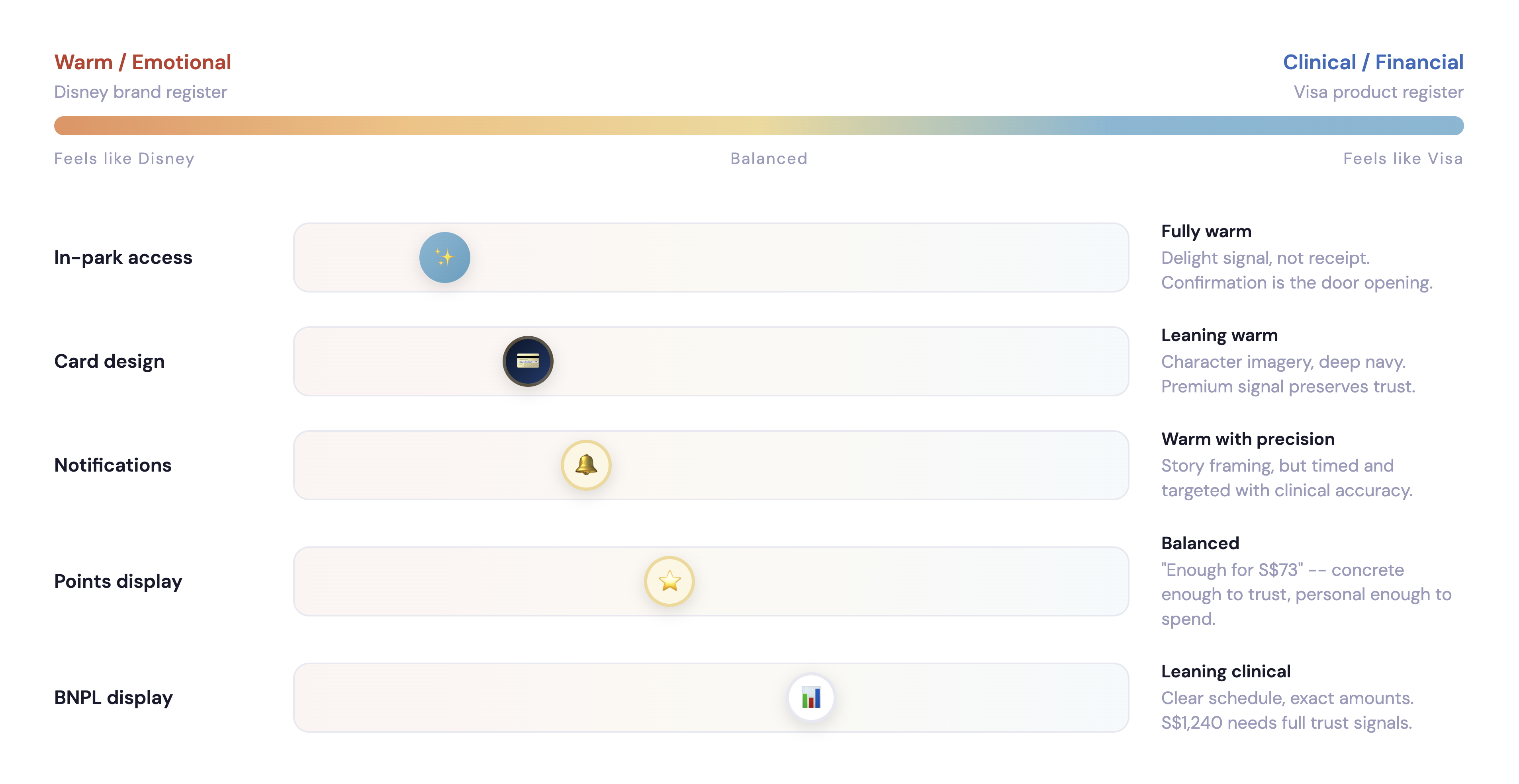
If it drifts too warm
Feels unsafe to hand over your card details. BNPL terms get buried in narrative. Payment confirmation feels ambiguous.
If it drifts too clinical
Feels like Visa with Disney stickers applied. In-park access reads as a payment terminal. Points feel like an account statement.
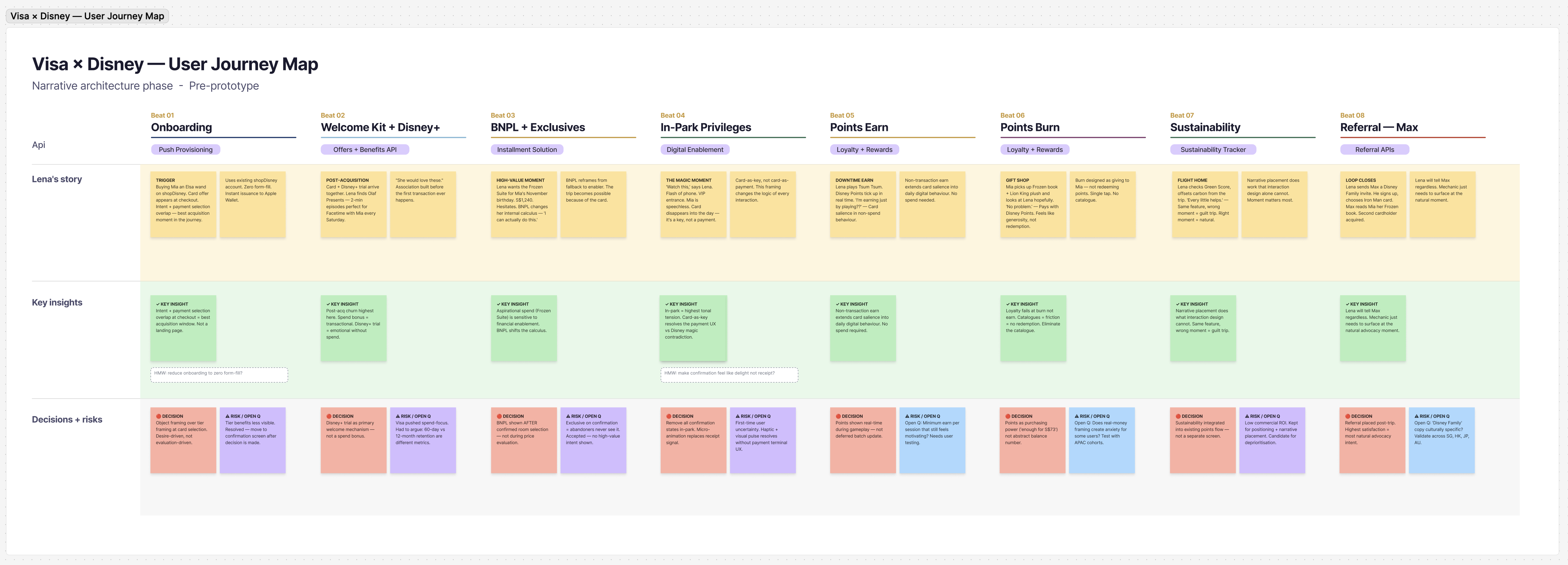
:: Process Documentation
The working journey map —
before any screens were designed.
This is the narrative architecture document built during the two-week pre-prototype phase. Eight story beats mapped across four swim lanes: Lena’s journey narrative, lo-fi wireframes showing UI logic, key insights per beat, and design decisions with explicit tradeoffs documented. Every pillar in the prototype traces back to a specific decision visible here.
8 Story beats mapped: Acquisition through referral, complete arc
4Swim lanes: Narrative, wireframes, insights, decisions
24 Design decisions documented: Each with accepted tradeoff
3 Open questions flagged: For Phase 2 validation research
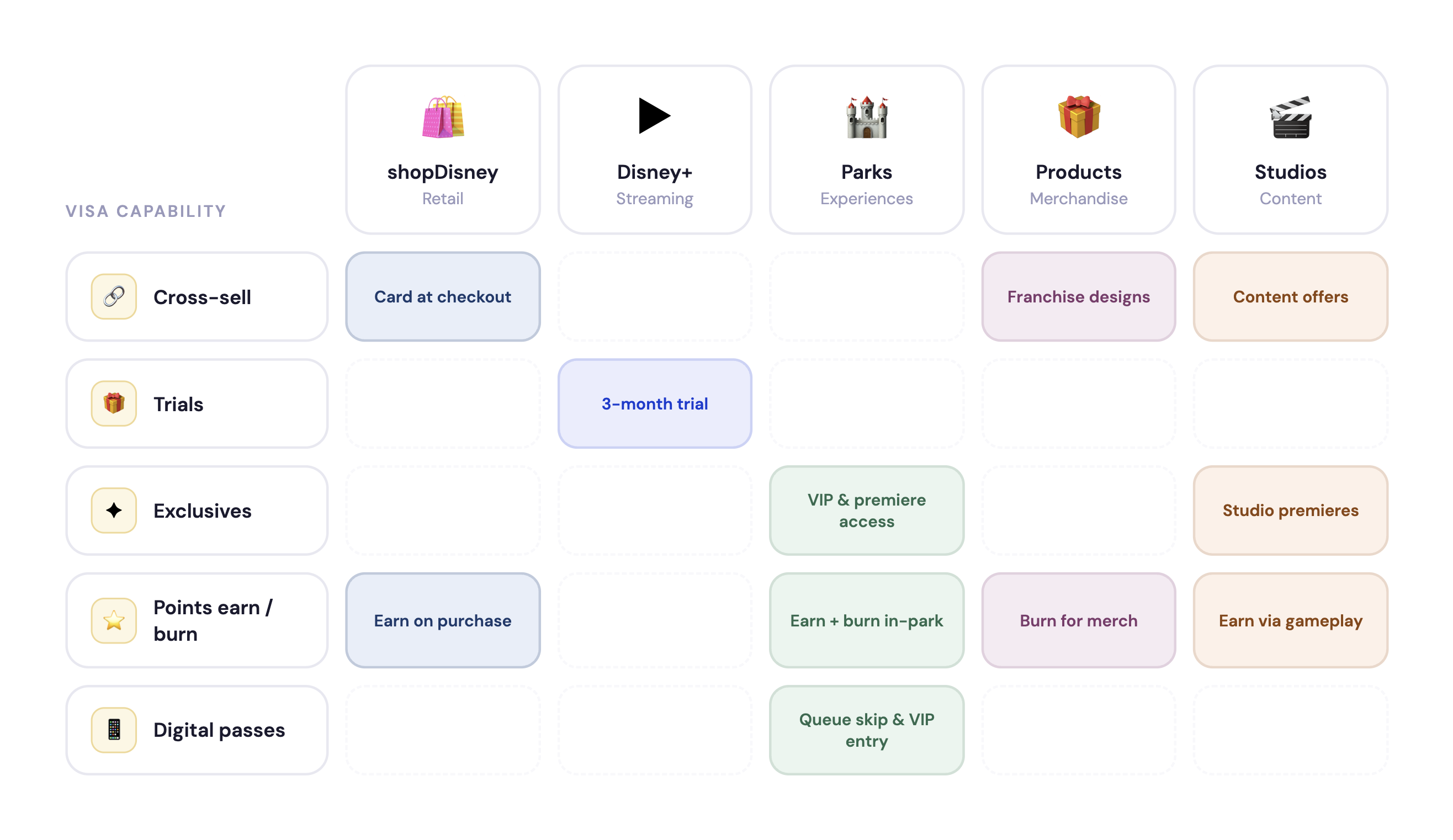
:: Five Pillars, One Commercial Architecture
Every pillar designed against
an explicit design question.
Each product pillar maps to a distinct commercial objective. Each was
designed by first identifying the design question - the tension to resolve -
then making a specific decision with an accepted tradeoff. Here is the
reasoning behind each one.
:: Pillar 01
Seamless Onboarding
Design question:
How do you acquire a cardholder at the moment of highest intent without breaking the experience that created that intent?
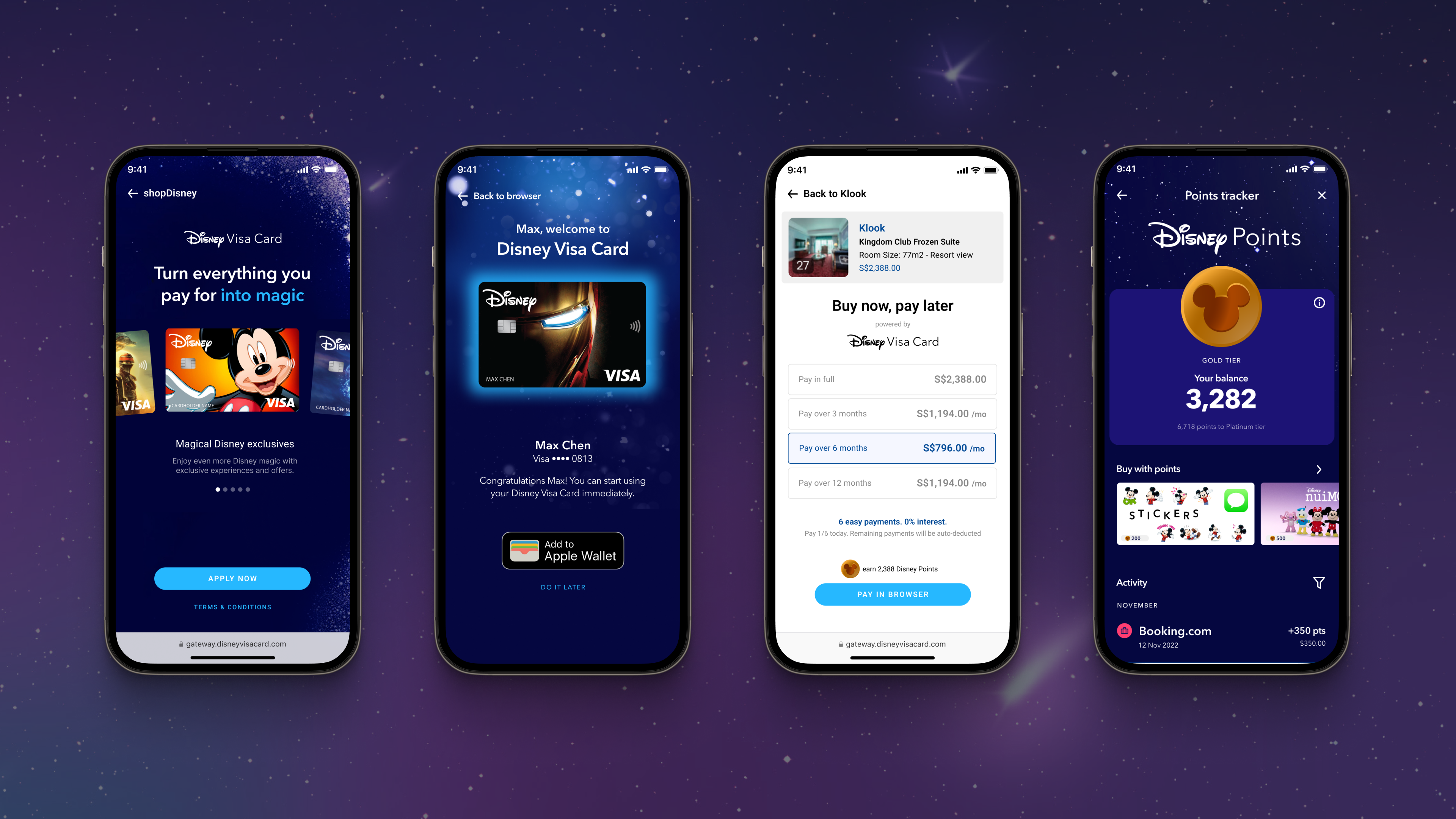
Checkout abandonment is the primary acquisition failure mode. The pattern: user sees card offer, evaluates it, decides friction exceeds benefit, completes purchase with existing card. Awareness generated and wasted in the same moment. The solution had two parts: placement at the shopDisney checkout where intent and payment selection overlap, and friction elimination via Visa's Push Provisioning Token Service - account draws on existing shopDisney data, card issues instantly, first transaction completes in the same session.
The decision
Object-based card selection over tier-based. Desire-driven choice reduces abandonment and raises the emotional valence of the first interaction.
The tradeoff accepted
Object framing is better for conversion but reduces transparency on tier benefits. Resolution: surface tier benefits at confirmation, after the emotional decision is made.
The API underneath
Visa Push Provisioning Token Service - instant digital card issuance to mobile wallet.
Zero form-fill required.
Commercial objective
Reduce acquisition friction. Maximise conversion at point of purchase intent. First transaction in same session.
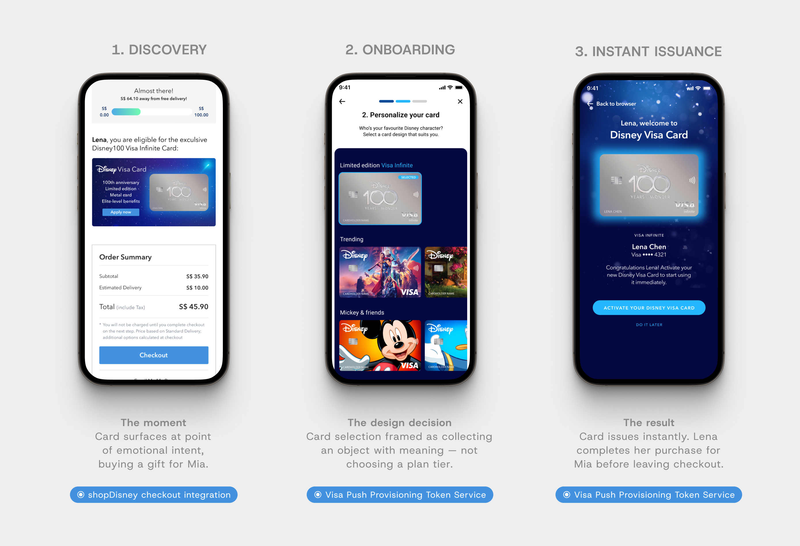
// Acquisition & onboarding flow
:: Pillar 02
Welcome Kit and Disney+
Design question:
How do you close the gap between acquisition and activation and create an association that lasts beyond the welcome bonus?
The 30 to 60 day post-acquisition window is where co-brand cards lose most cardholders. Conventional fix: spend threshold for a welcome bonus. This produces a transactional association - the cardholder activates the requirement, then evaluates the card on ongoing merits. I designed around a different theory: the problem is not incentivising spend. It is creating an intrinsic reason to engage. The Disney+ trial gives Lena something to do with the card relationship immediately - sharing Olaf Presents with Mia over Facetime - creating a recurring weekly behaviour attributable to the card without requiring a transaction.
The decision
Intrinsic engagement over spend incentive in the welcome window. The Disney+ trial is a retention mechanism, not a perk.
The argument I had to make
Visa's instinct was spend-focus. I argued spend-focus optimises 60-day activation while underperforming on 12-month retention - a transactional association vs an emotional one.
The API underneath
Visa Offers and Benefits API - welcome kit delivery and Disney+ trial activation tied to card issuance milestone.
Commercial objective
Drive spend activation. Deepen brand engagement in the post-acquisition window.
Build an association the card owns.
:: Pillar 03
BNPL and Cardholder Exclusives
Design question:
How do you enable high-value aspirational transactions without making the card feel like a debt product?
BNPL carries a stigma problem in the premium co-brand context. Conventionally it reads as a fallback - the option for people who cannot pay in full. That association is toxic for a card trying to signal premium tier membership. Two decisions resolved this. Positioning: BNPL framed as a card tier benefit, not a payment fallback. Sequencing: BNPL appears after confirmed booking intent, not during price evaluation. During evaluation it reads as "I need help affording this." After confirmed intent it reads as "here is a smarter way to manage a transaction I have already decided to make."
The decision
Notification timing: exclusive surfaces on booking confirmation, not during the booking flow. Interrupting a conversion flow kills conversions. The exclusive reads as reward, not solicitation.
The tradeoff accepted
Placing the exclusive on confirmation means users who abandon before completing never see it. Accepted - they have not demonstrated the high-value spend intent the exclusive is designed to reward.
The API underneath
Visa Installment Solution APIs - flexible repayment tied to card tier, notification timed to booking completion.
Commercial objective
Drive high-value transactions. BNPL revenue from instalment fees. Tier retention driven by exclusive access.

// Cardholder exclusives & Installments flow
:: Pillar 04
In-Park Privileges
Design question:
How do you make payment infrastructure feel like it belongs to a Disney experience rather than interrupting one?
The framing shift was from card-as-payment to card-as-key. This changes the design logic for every interaction. Payment UX requires confirmation, authentication, receipt signal. Key UX requires speed, invisibility, delight signal. Practically: I removed every unnecessary confirmation state from the in-park flows. Standard payment shows tap, processing, approved, receipt. The in-park design shows flash phone, door opens. Processing is real but invisible. Confirmation is the door, not a screen.
The decision
Invisible confirmation replaced with micro-animation - a brief haptic and visual pulse that reads as delight rather than system feedback. Confirmation should feel like a Disney moment.
The risk taken
Invisible confirmation creates uncertainty for first-time users. Accepted - micro-animation addresses this without reverting to payment terminal UX patterns.
The API underneath
Visa Digital Enablement Programme - card token activates park access privileges and digital passes in real time.
Commercial objective
Drive card-present transaction share within the park. Increase per-visit spend through frictionless payment. Generate advocacy through a daily brand experience.
:: Pillar 05
Points Earn and Burn
Design question:
How do you make an abstract loyalty balance feel like a live, spendable asset rather than a number that accumulates?
Loyalty programmes fail at burn more than earn. Redemption catalogues create decision cost that discourages redemption - commercially perverse, since an unredeemed balance is a liability not a retention mechanism. I redesigned burn around the gift shop moment: Mia picking up the Frozen book and looking at Lena hopefully. The interaction had to match that emotional register - single tap, immediate, no catalogue navigation. Points displayed as purchasing power context ("enough for S$73 at the gift shop") rather than abstract balance reduces the cognitive translation work that discourages redemption.
The decision
Burn framed as collecting, not redeeming. NFTs give points a reason to spend that feels like owning something rare — not a transactional exchange.
The design principle
Balance shown as a live feed of activity — every transaction visible with merchant name, date, and exact points. Abstract balance becomes concrete history.
The API underneath
Visa Loyalty and Rewards APIs - real-time earn and burn across physical and digital surfaces with cross-channel balance synchronisation.
Commercial objective
Drive spend frequency via points accumulation motivation. Extend engagement beyond transactions. NFT scarcity creates urgency to earn faster.
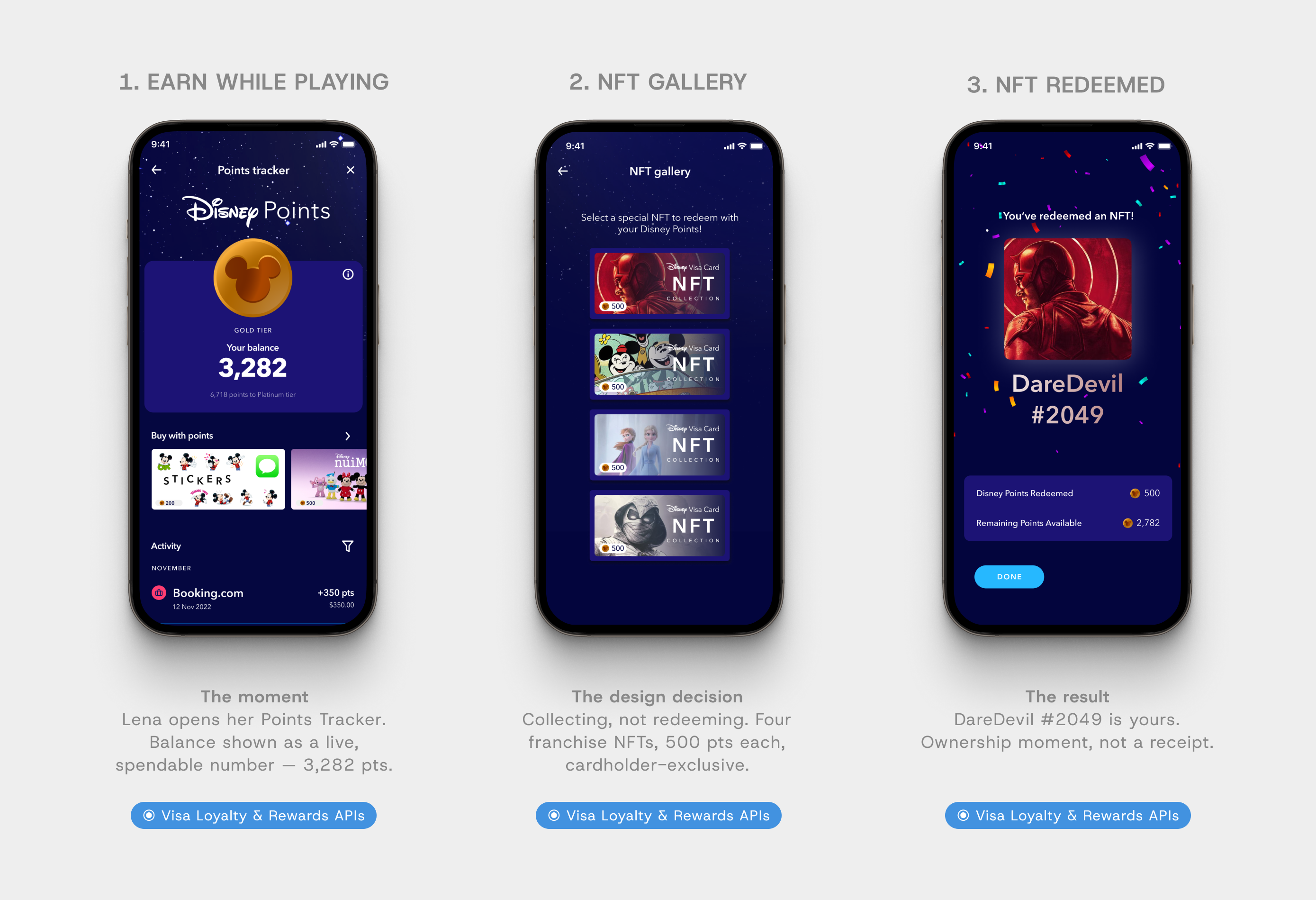
// Rewards (Points Earn & Burn) flow
:: Pillar 06
Referrals and Sustainability
Design question:
How do you design a referral mechanic that feels like natural behaviour rather than a programme?
Referral mechanics fail when they feel like schemes. The design insight: Lena does not need a mechanic to tell Max about the trip - she will do it regardless. The question is not how to motivate a behaviour that does not exist. It is how to provide the right mechanism at the moment the existing behaviour naturally occurs. The Disney Family framing matches the emotional register of that moment. The sustainability tracker - placed on the flight home, a reflective beat - serves dual purpose: expresses Lena's values at the right moment, and differentiates the product's positioning. Not a green badge on a separate screen. A use of points at a specific moment in the same interface as every other points action.
The decision
Referral placed post-trip, not mid-trip. The moment of highest satisfaction and most natural advocacy intent is after the experience, not during it.
The tradeoff accepted
Sustainability tracker is a modest interaction with secondary commercial case. Kept because narrative placement does the work the interaction design alone cannot - it lands as natural, not tokenistic.
The API underneath
Visa Sustainability Tracker API and Referral APIs - carbon offset via loyalty balance, referral bonus on new account activation.
Commercial objective
Drive family acquisition at near-zero incremental cost. Open a second primary cardholder relationship with its own spend trajectory.
// Spend Insights & PFM flow
// Referral Program flow
:: The Ecosystem Logic
A product strategy map,
not a feature grid.
Every component — offer cards, filters, map pins, collection modules, deal hierarchy badges — was built for localisation flexibility. I directed the junior designer across the library, owned all Figma documentation, and ran engineer handoff sessions directly.

:: Prototype and Delivery
Built to be felt,
not presented.
A slide deck lets decision-makers engage intellectually with an argument. An interactive prototype forces them to engage experientially with a product. The distinction matters because the argument we were making was about emotional resonance - that this product could create a feeling that drives commercial behaviour. You cannot demonstrate that on slides. Every transition in the prototype was considered from this perspective: the queue-skip at Mystic Manor, the points burn at the gift shop, the card issuance at checkout - all built to be felt in the hands of someone who has never seen the product before.
Disney's response moved the conversation from whether to how. That is the outcome a prototype in the room is designed to produce.
Reflection: Visa x Disney
The story is not packaging for the product. The story is the product. Features are only as strong as the human moments they belong to.
:: What I Would Do Differently
Phase 1 proved the model.
Phase 2 would validate it.
The narrative-first methodology produced a coherent, commercially grounded product. What it did not produce is confidence that Lena and Mia's story is the most commercially powerful frame for the actual APAC cardholder base. The character choices were made from strategic analysis and journey mapping. They performed well in the room. But "performed well in the room" and "validated against real cardholder behaviour" are different standards.
Before a second phase I would want qualitative research across APAC markets - specifically on relational motivation structures for Disney consumption and on which transaction categories are most sensitive to aspirational spend enablement. I would also build a validation framework into delivery: instrumented prototypes, a testing protocol, and explicit success metrics per pillar before any pillar moves into build.
The honest limitation
"Performed well in the room" and "validated against real cardholder behaviour" are different standards. For a product at this commercial scale, the difference matters.
1
Qualitative Research
🔍
Motivation mapping across APAC
- Relational Disney consumption by market
- Which transaction categories are most aspirational
- Validate or revise the Lena/Mia character frame
Output
Research-backed character framework
1
Instrumented Testing
📊
Per-pillar success metrics
- Define explicit metrics before testing
- Instrument prototype for conversion signals
- Test key decisions: onboarding framing, BNPL sequencing
Output
Confidence rating per pillar. Prioritised build sequence.
1
Phased Build
🚀
Highest-confidence loop first
- Onboarding to Disney+ to park intent
- Instrumentation built in from day one
- Live data informs remaining pillar build sequence
Output
Live product with measurable signals per pillar.
What Phase 1 proved
The partnership is designable.
Commercial thesis is coherent. Emotional register is right. Business case is tangible. Disney leadership moved from whether to how.
What Phase 2 answers
Whether the story is the right story
Is Lena and Mia the most commercially powerful frame for the actual APAC cardholder base? Research would confirm or revise. That uncertainty is the honest limit of the methodology.
